
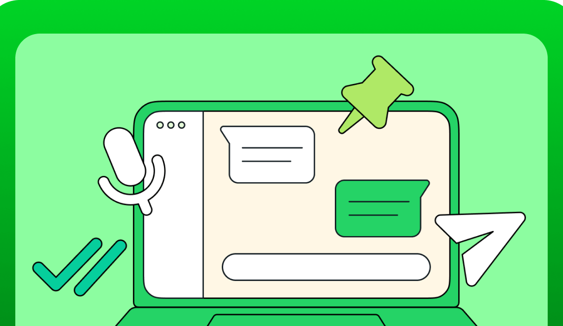
WhatsApp is a fantastic case study in successful UI/UX design. Below is the breakdown of its key strengths and the lessons (aspiring or seasoned) UI/UX designers can learn from it.
Simplicity and Focus
- Core Purpose Remains Clear: WhatsApp’s core purpose is straightforward messaging. While they’ve added features over the years (like voice/video calls, status updates), the act of sending and receiving messages remains at the forefront. This prevents feature bloat and keeps the user experience easy to understand.
- Uncluttered Interface: The layout uses a lot of whitespace, and options are clearly presented. This minimizes cognitive overload so users can focus on communication.
Intuitive Navigation & Familiarity
- Conventional Tab System: Tabs for “Chats”, “Status”, and “Calls” are a familiar pattern in many apps. This makes WhatsApp easy to learn for new users.
- Recognizable Icons: WhatsApp uses commonly understood icons (phone for calls, camera for image sharing, etc.) which speeds up interaction and reduces the need for explanatory text.
User-Centric Features
- Cross-Platform: WhatsApp functions seamlessly across Android, iOS, and web, allowing users to communicate regardless of their device.
- Multimedia Emphasis: The ability to easily share photos, videos, location data, and voice notes enriches the messaging experience, mirroring real-life conversations.
- End-to-End Encryption: This addresses a key user concern about privacy and security, building trust with the platform.
Lessons for UI/UX Designers:
- Functionality is King: A “bells and whistles” approach is less valuable than an app that does a few things extremely well. Prioritize the core user experience.
- Don’t Reinvent the Wheel: Leverage familiar design patterns and navigation schemes to create an easily understandable product.
- Put Users First: Understand what’s really important to your users and build the experience around those needs. Security, cross-compatibility, and ease of use are often highly valued.
- Whitespace is Your Friend: A clean, open interface is easier on the eyes and makes important information stand out.
- Iterate and Evolve: WhatsApp has gradually enhanced features over time. This shows the importance of listening to user feedback and making improvements while
- maintaining the core experience.
How to Apply Each Principle in your next design?
Implementing WhatsApp’s Design Principles
- Simplicity and Focus
- Define Core Functionality: Clearly outline what your app or website does best. What are the 2-3 fundamental tasks users should be able to accomplish?
- Prioritize During Development: Continually ask yourself, “Does this new feature/element directly support our core purpose?” If not, reconsider its importance.
- Reduce Visual Clutter: Use whitespace generously. Employ subtle color palettes and clear typography to guide the eye.
- Intuitive Navigation & Familiarity
- Leverage Design Patterns: Use familiar tab systems, menu layouts, and iconography where appropriate. Don’t make users re-learn how to navigate.
- Consistency is Key: Maintain visual and interaction patterns across your app or website. A predictable experience builds user confidence.
- Test with New Users: Observe how people who have never used your product interact with it. This highlights areas where your navigation might not be as intuitive as you think.
- User-Centric Features
- User Research is Vital: Surveys, interviews, and observation will reveal your target users’ pain points and desires. Build features that solve their problems.
- Prioritize Accessibility: Consider users with visual, hearing, or motor impairments. Provide alternative text descriptions, sufficient color contrast, and keyboard navigation options.
- Feedback is Key: Establish ways to gather user feedback. This could be through in-app surveys, support channels, or analyzing usage data.
WhatsApp’s clean design and laser focus on features that people truly use are key reasons for its massive success. But sometimes, it can be tricky to understand how these excellent principles actually translate into the decisions we make when designing our own apps and websites.
That’s why it’s helpful to see a specific example. Let’s imagine we’re creating a recipe sharing app. How can we apply those WhatsApp lessons of simplicity, navigation, and user-focused design? Below are a few ways these principles would guide our decisions:
Example: Designing a Recipe Sharing App
- Simplicity: Focus on easy recipe searching, clear instructions, and the ability to save favorites.
- Navigation: Use familiar tabs like “Search”, “Browse”, “My Recipes”. Use clear icons for sharing, adding comments, etc.
- User-Centric: Include filter options for dietary restrictions, time limits, or cuisine type. Incorporate a feature to easily scale recipes based on servings.
Remember:
- Iteration: Design is rarely perfect from the start. Use feedback to refine your work.
- Context Matters: While WhatsApp provides great general principles, always tailor your design to your specific product and audience.
Hero image: © WhatsApp