
Introduction
Spotify, a leading music streaming service, has gained millions of users worldwide. Its success is attributed not only to its vast music library but also to its exceptional user experience (UX) and user interface (UI) design. This analysis delves deep into various aspects of Spotify’s design, highlighting key lessons that UX/UI designers can learn and apply in their work.
User-Centered Design
Understanding Users’ Needs
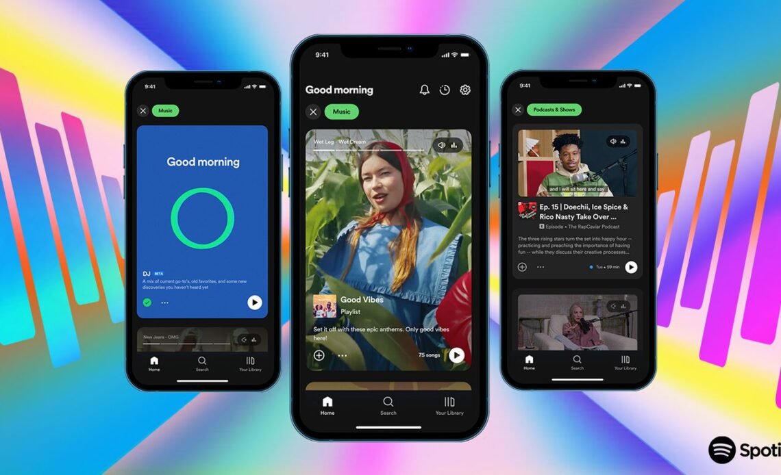
Spotify excels in understanding and catering to its diverse user base. The app’s personalized playlists, such as “Discover Weekly” and “Release Radar,” showcase its understanding of user preferences. By leveraging user data, Spotify curates playlists that align with individual tastes, enhancing user satisfaction and engagement.
Lesson for Designers: Prioritize user research and feedback. Create personas, conduct user interviews, and analyze usage data to tailor experiences that resonate with your target audience.
Consistency
Design Uniformity
Consistency is a cornerstone of Spotify’s design. The app employs a uniform color scheme, typography, and iconography across its various platforms (mobile, desktop, web). This ensures users can transition between devices seamlessly without experiencing a jarring change in the interface.
Lesson for Designers: Establish and adhere to a comprehensive style guide. Consistent design elements make the app look cohesive and help build user familiarity and trust.
Simplicity
Minimalistic Interface
Spotify’s interface is clean and minimalistic. The home screen displays only essential elements, such as recently played tracks, recommendations, and playlists. This simplicity reduces cognitive load, allowing users to focus on discovering and enjoying music.
Lesson for Designers: Strip down the design to its essential components. Avoid clutter and unnecessary features that may overwhelm users. Aim for clarity and ease of use.
Navigation
Intuitive Navigation
Spotify’s navigation is straightforward, with a bottom navigation bar providing quick access to Home, Search, and Your Library. This design choice aligns with common mobile usage patterns, ensuring key sections are always within reach.
Lesson for Designers: Design navigation structures that are intuitive and require minimal effort. Conduct usability testing to ensure users can navigate your app effortlessly.
Accessibility
Inclusive Design
Spotify is committed to making its app accessible to everyone, including users with disabilities. Features like adjustable text sizes, high-contrast themes, and screen reader support demonstrate this commitment. Ensuring the app is usable by people with visual impairments broadens Spotify’s user base and adheres to inclusive design principles.
Lesson for Designers: Incorporate accessibility features from the outset. Use tools like WCAG (Web Content Accessibility Guidelines) to ensure your app is inclusive. Accessibility should be an integral part of your design process, not an afterthought.
Visual Hierarchy
Guiding User Attention
Spotify employs a well-defined visual hierarchy to guide users’ attention. Primary elements like song titles and album covers are prominently displayed, while secondary information, such as artist names and track durations, is presented in smaller, lighter fonts. This approach helps users quickly identify and focus on key information.
Lesson for Designers: Use size, color, and placement to create a visual hierarchy. Highlight the most important elements and ensure that secondary information does not distract from the primary message.
Microinteractions
Enhancing Engagement
Spotify’s use of microinteractions, such as the animated heart icon when liking a song, adds a layer of interactivity that makes the app feel more engaging and responsive. These subtle animations provide feedback and make user actions feel satisfying.
Lesson for Designers: Implement microinteractions to enhance user engagement. These small, interactive elements can significantly improve the overall user experience by providing immediate feedback and making the interface feel more dynamic.
Feedback
Immediate User Feedback
Feedback is crucial in ensuring users feel in control of their actions. Spotify provides immediate feedback for user actions, such as adding a song to a playlist or downloading a track for offline use. Visual cues and confirmation messages help users understand the outcome of their actions.
Lesson for Designers: Always provide clear and immediate feedback for user actions. This helps prevent confusion and reassures users that their inputs have been acknowledged.
Content Organization
Logical Structuring
Spotify organizes its content logically, making it easy for users to find what they’re looking for. Music is categorized by genres, moods, activities, and more. This intuitive categorization helps users discover new music effortlessly.
Lesson for Designers: Organize content in a way that aligns with users’ mental models. Use categories and labels that make sense to your users, and ensure that related items are grouped together logically.
Continuous Improvement
Iterative Design
Spotify’s commitment to continuous improvement is evident in its regular updates. The app frequently introduces new features, enhancements, and bug fixes based on user feedback and data analytics. This iterative approach ensures that Spotify remains relevant and competitive.
Lesson for Designers: Adopt an iterative design process. Regularly gather user feedback, analyze data, and make improvements to your app. Stay agile and be willing to adapt to changing user needs and technological advancements.
Conclusion
Spotify’s success as a music streaming app can be attributed to its exceptional UX/UI design. By focusing on user-centered design, maintaining consistency, simplifying the interface, ensuring intuitive navigation, incorporating accessibility features, establishing a clear visual hierarchy, using microinteractions, providing immediate feedback, organizing content logically, and committing to continuous improvement, Spotify has set a high standard in the industry.
Takeaway for UX/UI Designers: Studying Spotify’s design principles and practices provides valuable insights and inspiration. By applying these lessons, you can create user experiences that are not only functional and efficient but also engaging and delightful.
Hero image: © Spotify